Last Update: October 2022. (At the bottom of this page you can also find Image Guidelines for Interior Kindle Images ).
I run a publishing company specializing in literary fiction -- novels, stories, poetry, essays. I wanted to keep a large online collection of ebook covers which artists and authors can use as examples and reference points when planning ebook covers. Most artists are versatile and flexible, but may not have specific experience in ebook publishing and not be attuned to some conventions and expectations. A lot of notions about ebook cover design comes from what you know of bestsellers and books you read in school. This is helpful up to a point, but it would also help to see what many covers for "literary fiction" in the indie press world looks like. Browsing on Amazon is fine of course, but you are more likely to find commercial-looking covers than covers for high quality indie fiction. Often, I produce ebooks by unknown authors, so the author's name shouldn't matter that much on the cover. Note: These screenshots are from my personal ebook collection on my Kindle app. Some screenshots aren't cropped too well, and some covers are duplicated or have marks over them indicating Percent Read and New(sorry about that). (These banners appear on the device only and not on the book description page). I generally admire most covers listed here, though a few not-so-good covers were also included in these screenshots. The screenshots here are 700 pixels wide with 4 covers per row (which means it shows 175 pixels wide for each ebook). (Warning: screenshots might be reduced if you are viewing from your phone!) Typically on Amazon, the ebook covers appear as 150-175 pixels wide on the search results page and 300 pixels wide on the ebook product page.
Ebook covers serve several purposes: First, they provide an initial visual motif for remembering a title or picking it out in a list of search results. Second, they call attention to the name and/or title when a consumer is shopping. Third, they give the reader a clue about the book's subject matter and if possible – the setting. (Eiffel tower = Paris, etc). So if there's a spaceship on the cover, chances are that it will be sci fi. Fourth, it provides an overt clue about what kind of book it is – what genre it belongs to. The consumer wants truth-in-packaging. If looking for a book about romance and love, maybe you'll have some easily identifiable image that links the book to the genre. An effective cover should provide a sense of the mood and tone and possibly even an air of mystery. Why is there a burning house on the cover? Or an old family photo? Or a gun?
Finally, a cover should have some aesthetic considerations. It can or should be abstract, with colors that provide effective contrasts. The font should be easy to read. Some covers merely take a photo to represent the subject matter. That's fine for some books (especially those about a specific setting), but it is implying a one-to-one correspondence between the representation and what the book is about..
Articles about Ebook Cover Considerations: Jessica Bell on Eye-Catching Design . In October 2022 she published an ebook on cover design called Can You Make the Title Bigga?: The Chemistry of Book Cover Design . Also: 7 Common Cover Designer Mistakes and Color Theory in Ebook Cover Design. Bookdesigner has a monthly Best Book Cover award and several articles such as Judging a book by its cover. Joel Friedlander (who runs that blog) makes a lot of commentary in the month's contest about why something works and doesn't work. Admittedly some of the subjects are in genres easy to design for. They may work for their particular genre, but not for literary fiction or short stories or poetry. Finally there's a book cover gallery about one of my favorite book designers George Salter. Highly recommended.
Also: Design specs for ebook covers are at the bottom of this web page. It provides data about file format, pixel dimensions, etc.
Here's a quick list for evaluating the effectiveness of an ebook cover:
First, I'd like to talk about certain categories of books which are easier to produce covers for (and probably not as important for us)
Here are some considerations for literary fiction (which don't try to belong in a single genre) and specifically story collections:
One last thing. A common way to advertise your ebooks is through ebook newsletters. Each daily newsletter normally brings 20+ book ads with the ebook cover. The art included with these newsletters tends to be small, so you should make sure that a thumbnail conveys the cover concept adequately. I haven't verified these dimensions, but a quick check in my browser reveals that Bookbub uses 215 pixels, Bookgorilla uses 180 pixels, Bargainbooksy uses 250 pixels, and Fussy Librarian uses 170 pixels.
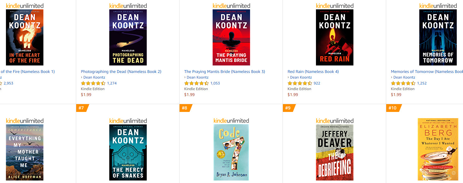
The next two screenshots feature Amazon best sellers for short stories. I don't necessarily like these designs. Some are even ghastly. (But I do love Things they carried by Tim O'Brien (war stories from Vietnam -- very famous) and Collected Stories of Eudora Welty (also very famous). You can see a lot more example of covers for story collections further down on this web page.
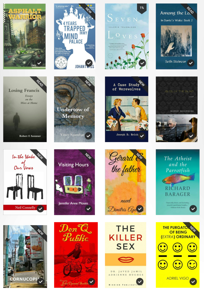
I wanted to point out some covers which do things particularly well – especially those involving short stories or poetry. Seven Loves is a great story collection with a bright background and good outdoor colors (although it's a compact title). Asphalt Warrior (novel) by Gary Reilly uses a very cool series of urban illustrations for the ebook covers of its series– which are unique though not particularly good in thumbnail. Gary Reilly is a great undiscovered writer who wrote a series of related books about a taxi driver – check out the other ebook covers in the series. (I comment about more titles if you scroll down). Note that many of these titles are indie titles – in some cases, the author's name is obscured or de-emphasized, but I think that several titles below (Don Q Public, Cornucopia, Isles of the Blind) could have used more lettering contrast to bring out the author's name more. Many titles here use only a single central element (Visiting Hours, In the Wake of Our Vows, Undertow of Memories) which allowed the author font to be bigger and more prominent.
3. Study the covers below. Selected Stories by T. Sturgeon is a classic collection of sci fi tales – the author is fairly famous. Several covers here are about poetry and more abstract. Harmonium is a famous poetry collection by a classic poet. Imperfect Tense and Waitress at the Red Moon Pizzeria are great covers for poetry titles – one more representational, while the other is just a flowery splash of colors. Cat May Look at a King may look pretty goofy, but it's a children's book and cat face on a human body is eye-catching and appealing.

4. Orientation is a (very famous) story collection about office workers. You convey the variety while keeping an overall vibe. I just adore the cover for Life (below, a realistic novel by a young Chinese novelist). I love how minimalist it is, and how it hangs in 3 dimensional space, with the hand and chopsticks breaking the space. On the other, this is a super-compact and generic title, so that leaves a lot of room for the artist to design around. From Afar conveys solitude in a European city (actually it's St. Petersburg). It has a nice impressionistic cover and somewhat forlorn urban landscape. This tale by Frank Scozzari is about an American off to find his true love in St. Petersburg, Russian through a dating service. Somehow the cover gives me the sense it's not going to have a happy ending!I stopped Time has great colors – and the title stands in a whitened cloud on the woman's torso. Adlandia (sorry, the last two letters are covered by the percent read graphic), but it really needs better contrast on the author font.

5. Use of Photos with People.In some of the covers above and the covers below, we see very interesting photographs of people. Bowl of Fruit (above) depicts a pretty young woman from the past; the title refers to a year a century ago, and when combined, you make the connection that it is somehow about the life of a woman at the turn of the century. The bluish tint is both visually striking and reinforces a connection with the past. Great cover! In Sweet Springs (above) you have a pretty woman dressed in a certain style outside. Maybe she is going on a trip? I actually find the photo to be too busy and loud, but maybe we are to think it's about a strong-minded woman going on a trip. Maybe? Another Place you've never been (below) has one of the most striking photos I've ever seen – a small girl bending down on a pier next to a fish head. I love this photo and the girl's strange expression, but honestly I have no idea how it relates to the novel itself. Is it about a child? Strange encounters with the natural world? Quirky/out-of-whack perspective towards life? I don't know – but it certainly got my attention all right. On the other hand, I love the photo for Practice House (below). Besides the prettineess of the girl, there is the drabness of her dress and the way she is staring far off in a dreamy way. Also, the beige colors suggest domesticity, mundane life. (I read the first two chapters; it's about two Scottish sisters who fall in love with American Mormon missionaries in the 1920s and end up moving to USA with them).

6. More great covers above and below. Above you have Potatoes are Cheaper (classic humor stories by a well-known author), Belles Lettres Papers (humorous novel about a book critic), Musuem of Abandoned Secrets, (gorgeous photo of art objects, with great font and colors). I also love the Dreams from the Slumber Yard (and keep meaning to read that novel).
7.Below you have Call me Pomeroy (strange, satirical political novel with very striking cover image!) , Brain Vomit (Essays, Stories, etc) , Awake in the Dark (stories with a historical theme – WW2, trauma). Broken Places (great novel about a house caught on fire and a father who was a fireman). Whirligig (unconventional fantasy/horror novel).

8.Life in the Lion's Mouth (below) is a great novel about a circus adventure – maybe too easy to illustrate? (The thumbnail is hard to see, but we can see the lion! Zaremba is a novel about an Eastern Europe literary romance. Can't see very close, but background leaves a lot of empty space, and that is good.

9. Pay attention closely to the ones below (especially whether "Stories" is mentioned and how long and short titles are handled. Most of these collections are by unknowns. Also, note how covers can incorporate multiple elements to convey a story collection. If I loved you, I would tell you this, . Also, notice True Colors with effective use of stock images. I love the bright yellow background and the close up of the curving lizard body – matched by the curvy font. I really love the author James Hanna, and his collection A Second Less Capable Head is interesting, strange to look at (even if the illustration is too light to make sense of). Yes, there is a story about a man with two heads, so it's trying to represent a striking image. Love the painted sketched frame. The other covers below are not that creative, but still convey subject matter and genre.
10. Below are great uses of multiple elements to subtly indicate a story collection : Foreign Soil is a good scrapbook-kind of cover suggesting that there's a lot of things inside. White Tiger on Snow Mountain uses contrasting black and white to suggest both scenery and layers of meaning. I actually love the minimalist You Won't Remember This by Kate Blackwell. There's really only one object on it, but the overlaying geometric patterns of the background resemble that of the chair. (Its description reads: "this debut collection illuminates the lives of men and women who appear as unremarkable as your next-door-neighbor until their lives explode quietly on the page. Her wry, often darkly funny voice describes the repressed underside of a range of middle-class characters living in the South.") Those colors are just gorgeous as well.

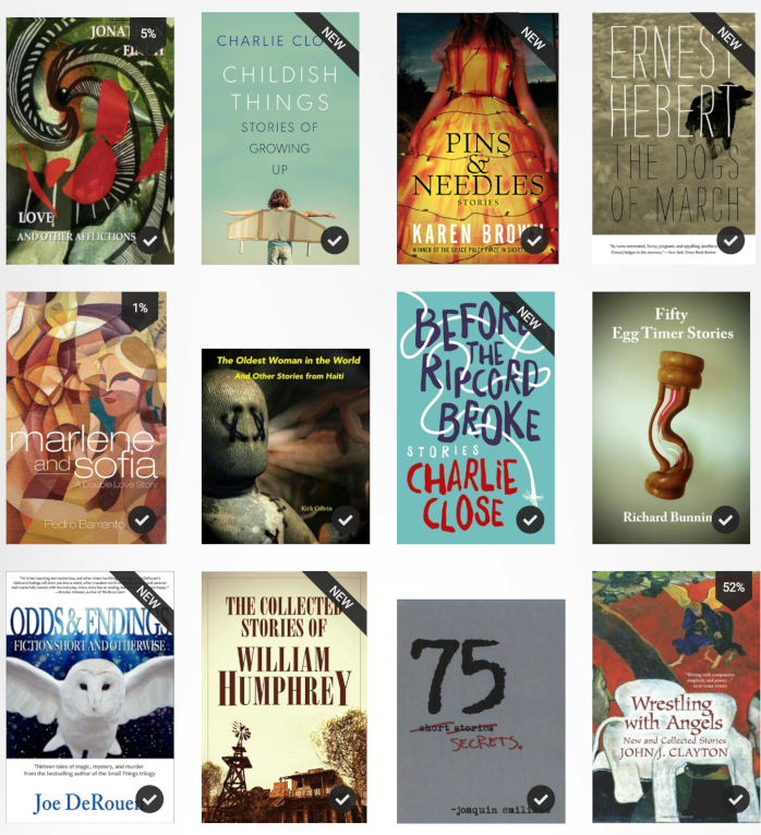
11. Charlie Close has some great simple covers. Nothing fancy, but effective Childish Things (below) is a simple theme of youth. I actually think. Before the Ripcord Broke is also great. I have no idea what a ripcord is, but I definitely get the sense of "chords dangling everywhere. (And yes, the letters are chord-like, and the color contrasts are great. Pins & Needles (below) is an outstanding cover – though I have never noticed the ebook before. Apparently it won a major award; it's about mother-daughter things, pregnant teenagers. Love and other Afflictions is great collection of stories about love, madness, delusion. I like that. Fifty egg timer stories is a great cover and effective title. The author specifically came up with the concept of egg timer for 3 minute stories, and so visually it was easy to convey it.
12. BELOW – Who I was supposed to be uses an eye-catching photo with a lot of white space to put title and author. Bigness of the World is a bestselling award-winning story collection. It's very busy – more than I would have preferred but the stories are about "about men and women confronting the unmapped and unexpected." I'm ready for the unexpected all right! Also notice the 3 story collections by Eric Puchner (Last Day on Earth, Music through the Floor and Model Home) have interesting covers. Note that all of these were originally printed books, so they could use a larger canvas.

13. Above you have several compilations which just include nice fonts and a color or pattern behind. For Doris Lessing's African Stories (above) or Reynolds Price Collected Stories above, you are just providing a nice box for a well-known product. Worth noting also below is the ebook cover of a woman's face sideways without any text whatsoever! This actually is for Collected Stories by Clarice Lispector (a famous Brazilian author). Presumably, most people who would buy this ebook already know who this author is. Also, I love (below) the Months and Seasons by Christopher Meeks (great use of stock images)

14. (Above) I love the formal composition of Glenville Obrian Lovell's Going Home in Chains – though the colors of the person are kind of atrocious. (Book description: Shifting between the Caribbean and America, these stories arrive doused in magic, musicality and humor. From the title story about a man trapped in the nightmarish glare of post 9/11 scrutiny after he forgets a bag in Grand Central Station). Tiny Shoes Dancing by Audrey Kalman is also a great cover (she's a good writer too).
15. Below, Persistence of Memory by Jan Maher is great and intriguing and abstract; it's a dozen stories about how and why our memories shape our current crises. I have mixed feelings about this, but certainly an abstract cover suits the subject matter. Short stories by Nick Lenoir (with the eagle man) is certainly an attention getter – the author is a Romanian who has almost a fairy-tale childhood growing up in the forest and the book does have animal elements. I assume that the startling image for Sunruined by Andersen Prunty takes a good jarring image from one story. (I'm not into horror stories, but you should see these edgy and angry covers for Andersen Prunty's other ebooks.

16. (Below) Some story collections by famous people. Bruce Sterling is futuristic sci fi about fantastic worlds – I guess it fits. I love the compactness and colors of Collected Stories of Stefan Zweig. Occupational Hazards has a very memorable (and disturbing) cover image – I assume it has a horror theme. The party scene photograph of John Rowell stories matches the social milieu of the stories. I like the idea of Laws of Evening by Mary Yukari Waters – and even though it looks pretty good on the Amazon book page, on search results in 150 px you can't read any of the letters. Scribners published this volume – and Waters is great Japanese-American author, but the letters should have been made bigger and maybe sharper.
17. Below, I love the mysterious and off-the-wall photographs in the two Christopher Walker story collections (below). They convey a mood and atmosphere in a specific place (Eastern Europe). They convey this mood instantly. No subtlety here. Robert Scheckley (below)is a sci fi legend. There's the required galaxy photo in the background and all sorts of crazy colors and diagonals. (Again, though it's making the author's name an important part of the cover).

18. Below, I really enjoy the abstract shapes in the bottom part of In the Time of My Life by Joseph Sutton. I should mention that Joseph Sutton is a distinguished older unknown author, but I love the empty space. I don't particularly like the images in a frame on the cover -- especially on Maybe It was a Thursday which is too small to see. For Alone with You and A Taste of Ecuador, there's way too much text below the image, making the problem even worse. The two titles of one of my favorite writers (Valerie Trueblood) show nice colors and blended images. Marry or Burn seems too indistinct while Criminals uses a shape at odds with the story collection which are about love (maybe that was the point?)

19. Below are some great covers that grab attention. Mess (below) is about one man's quest to keep his apartment clean is very busy but has a simple prominent title -- though the author's name is hardly visible in the upper right. How Chance and Stupidity have changed history is a great dramatic painting which will presumably be discussed inside the nonfiction book. I like how Trying Not to Try, Demon-Haunted World and Nearly Complete Works of Donald Harrington consist mainly of wide and bright-colored rectangles containing text. Best American Erotic Poems (below-what a concept) has an unusual image, but the lithe, curvy figures are supposed to be suggestive. The two volumes of Kalila and Dinma (below) are beautifully illustrated, and even though it seems to include well known drawings, there's a nice variety of shapes which don't overshadow the text title.

20. (Above) just wanted to say that the Donald Harrington series is a 4 part series, each with the same type and form, switching out only the main image and one of the colors. One concept, beautifully executed. The Dobie Gillis stories conveys the goofy sense of nostalgia; even though Dobie Gillis stories later became a TV series, all of Schulman's ebooks have that same pop art theme. There are some classic collection of tales. Kalila and Dinma convey the cultural history of the volumes, though the Shahnameh volume is kind of hard to make out; what is being depicted inside the head/round thing shape? I like how Erotic Poems is being illustrated with a toothbrush and a (?) flower petal (or least a toothbrush cap). Lissome and elegant. Trying not to try is a book of ancient philosophy, and although the texts are the main cover elements, you can barely see an Asian sage (Confucius) in the background. This is a good use of lettering and shapes. It wants you to focus on the words and ideas than something as overt as a person.
21. Just wanted to say that Bob Stanley's Story of Pop Music (below) and Tim Oreilly's WTF and Colm Toibin's New Ways to Kill your Mother are great and effective covers which nonetheless are only typography! (Worth pointing out that these are nonfiction and somewhat self-descriptive.).

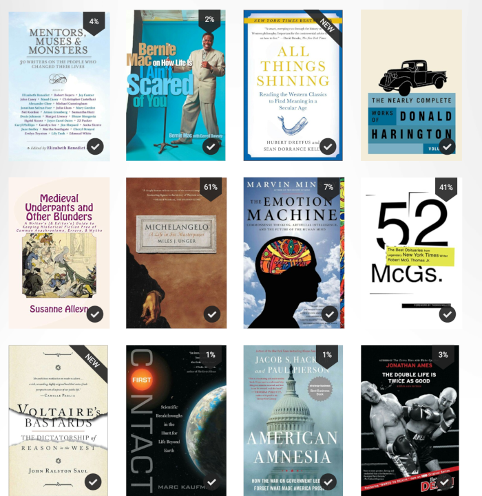
22. I love how the min-biography on Michelangelo has mostly negative space except for the artist's arm. Emotion Machine makes good use of coloring to make the brain drawing more unique. Double Life is Not As Good by Jonathan Ames uses a sports photo to convey his iconoclastic approach to magazine writing and a derring-do of a George Plimptonesque in-your-face kind of writer.
23.Below are some memorable covers: Life in the Lion's Mouth (below) is a great, descriptive cover for a colorful road novel, but the title is downplayed and the faded colors and drawings don't really show too well (they need a lot of contrast). Ronan Bennett's literary romance based in Africa is effectively conveyed through mosquitos carefully drawn though it might be too subtle for the casual glance.

24.Above, I love how several of these nonfiction titles (For the Love of Physics, Here's Looking at Euclid), use just a single simple icon to convey what would surely be a discussion of complete topics. This is Your Brain on Sex (above)doesn't really seem to have anything sexy going on here; it's more of a mechanistic/biological approach to the topic. Conversely, Nothing Remains the Same is abstract and colorful and indistinct, a perfectly appropriate way to convey how memory alters our conception of books. (Too bad that author Wendy Lesser's name doesn't prominently appear.

25. The two books by Lu Xun (above) are famous in China – they're classic writings, but I love just the gorgeous natural colors and empty space over the author's name. Conversely, I like how Witness to an Extreme Century provides a black and white photo to humanize the psychological topics discussed inside. (along with gold to highlight the author's name).

26. For essays below Lord of the Rings just has a mystical natural landscape, along with light font colors – which surprisingly contrast well. Exit West conveys queuing and criss-crossing the globe (it's a novel about traveling and emigrating). The handwritten fonts suggest forms, signatures, etc. Parable of the Sower brands the author with a red-yellow and white – with a strange purplish portrait in the background.

27. I just love the covers for the sci fi character-based novels by Robert Kroese and the retro sci fi covers below are just amazing. How Music Works by David Byrne (below) is another great minimalist text-only cover. Three-Body Problem (a very famous Chinese sci fi novel) has a lot of shapes and abstract imagery, suggesting mystery. Personally I think it's too busy,
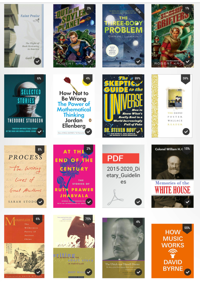
28. Below are some gorgeous covers by first rate books. Delusions of Certainty is an essay collection about philosophy and art. The abstract shapes definitely convey that. Strangers at the Feast by Jennifer Vanderbes is about a family squabble during Thanksgiving -- and the chaos that ensues. The blurb: "A series of tragic events bring these two worlds ever closer, exposing the dangerously thin line between suburban privilege and urban poverty, and culminating in a crime that will change everyone's life." Beautiful outdoor autumn scene with gold tint, with background the same color. The Karl Marx checkerboard cover is particularly great and colorful and inviting. Even though it's nonfiction, it could easily be used for fiction and you might even be able to use each square to denote another subject.
29. All of these are great covers though a little obvious (and have short concrete titles). Vida, a popular novel hides the whole image of a young woman and lets the paint colors overlap with it. Borrowed Time and At the Existentialist Cafe both are nonfiction for the general reader -- mainly type with one image in the background. I particularly loved the 20th Century in Poetry anthology which is lot more beautiful than it needed to be. I loved putting a man-made image of war inside the big zero.
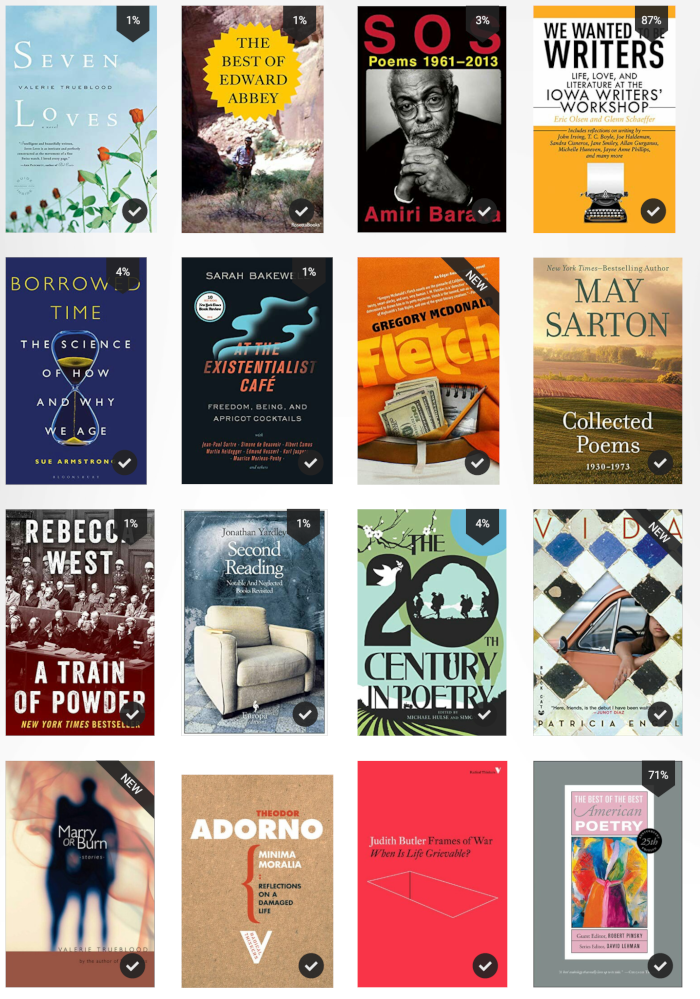
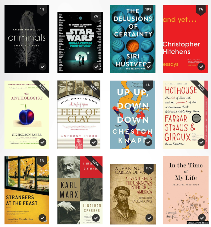
30. Of course, several books above are nonfiction and text-heavy. Indeed sometimes the text (At the Existentialist Cafe) overlays the image. With Adorno and Judith Butler all you can really do is to embellish the text. Several authors here (May Sarton, Adorno, Edward Abbey, Amiri Baraka) are practically household names in the book world. I like how Best of Edward Abbey uses a nature photo with a human (presumably Abbey) in the middle, de-emphasized, though we're sure it's him. Superimposing a sun shape with the title retains the natural element while making it possible to accentuate the title and author's name embedded in it).
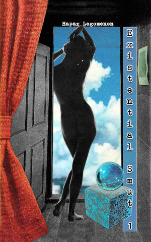
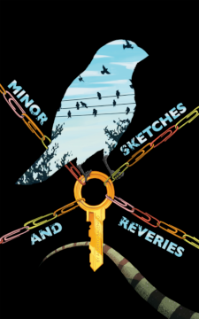
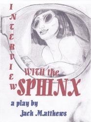
.Abruptions and Soldier Boys are both story collections – the second with a historic theme. Soldier Boys has a nice boyish portrait, but the most interesting and eye-catching thing is the purplish tint that everything has. Worker's Writebook is a writing guide where the main element is the author's wise profile. As someone with no artistic talent, I made it myself. Yet it is simple and effective and works mainly because the photograph is so good. Hanger Stout, Awake is a nolstalgic novella about youth and obsession with cars. I love the hand-drawn lettering and how the author's name is superimposed on diferent cars. I love how Abruptions contains a lot of detail in the different components of the brain – but in thumbnail you still get the effect of a brain full of a variety of stuff. Existential Smut 1 (erotica anthology, below) has small lettering on both the title and author, keeping the focus on the dark nude and the bright clouds behind. The simple form and composition make it easy to grasp what it's about, Although the title lettering Second Death of E.A. Poe (below) is kind of lost inside the hour glass for thumbnails, the iconic bird conveys the same thing, and the author's lettering jumps out. Minor Sketches and Reveries has outstanding contrasts and easily readable title typography – even though the author's name is somewhat hidden (it appears embossed on the golden key in the center). A lot of story elements are included which are found in the fantasy stories (keys, birds, lizards, paperclips). With My Heart for Hostage, the color and the images of the same woman in 3 different poses hovering above the man provide a great sense of the novel's tension. Finally Interview with the Sphinx (which I regret will never sell well because of what it is) has a great and perplexing book cover – with a variety of perspectives. (You are seeing the reflection of the woman-sphinx in the eyeglasses of the male interviewer). The lack of color allows for better detail of the grey sketch marks, and the text colors are easy to read. Boxes of Time is probably busier than I'd like, but the color contrasts are great, and the type works very well at low resolutions.


Here I am reproducing the cover art requirements, as stated by Amazon and Smashwords. Amazon easily accounts for 80-90% of sales, so they must be followed to the letter.
Here's some information about formatting/optimizing interior images. Eventually I'll link to some sample code I use, but the basic information is here. According to Amazon's pricing guidelines, the minimum price for under 3-10 MB is 1.99 and 2.99 for over 10MB. Because the images I use for my ebooks are mainly decorative – and not my main content – I've spent a lot of time optimizing image sizes to stay under 10 MB. Below is a screenshot from the Kindle Publishing Guidelines 2019.2 about images. Notably, this table doesn't appear on the published guidelines for images on reflowable ebooks . That leads me to think that the information below is somewhat out of date or confusing, but it's still useful as a general reference.

I think these estimates are much too conservative. For one ebook project involving 15 reflowable images, the IMG css for wide landscape setting is width="60%"; for portrait images my css for IMG is width="45%" – In these cases, I'm using display: block inside my DIV tag. I think I can use 15 images (not including the cover art) and still stay under 10 MB with images in the 200K-400K file size. Some of my landscape images have had pixel widths of 600-800px but ideally it should be 1000+ px width. For portrait images, the image width has ranged in the 600-800 range as well.
If I wanted a portrait image to fill the page, I'd make the containing DIV to have width=97% . (about 1.8 MB file size)
If I wanted a landscape image to fill the page, first I'd tried to make the image a square with a width of 1200-1800px. (about 500-1000K file size) The containing DIV would be width=95%.
See also: Tips and Advice for New & Indie Authors and my monthly column on ebook deals
Question? Comment? Contact me (Robert Nagle) here: IDIOTPROGRAMMER at FASTMAILBOX.NET. I run Personville Press (See some of our ebooks for sale).
#/media/File:Jurassicpark.jpg)